UrbanPiper POS Redesign
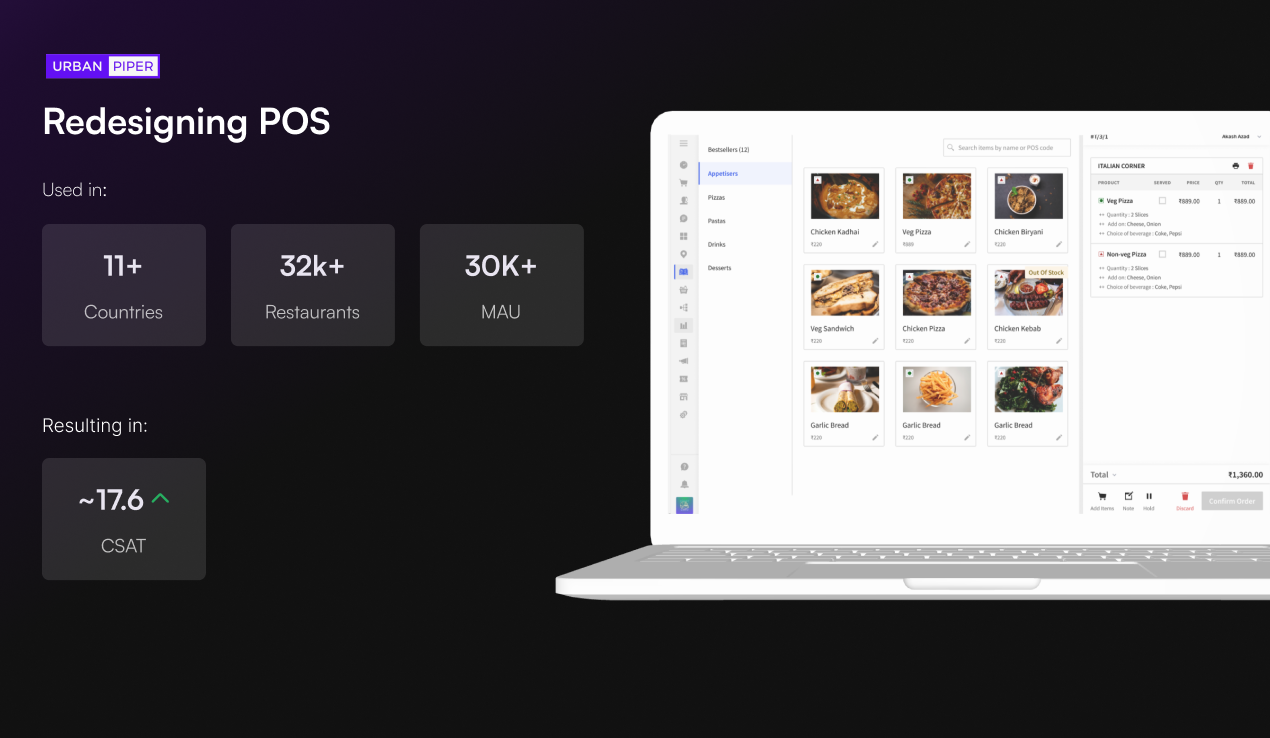
I led the end-to-end redesign of the POS used by 32,000+ restaurant partners. It lifted CSAT by 17.4%, cut onboarding time by 30%, and shipped through a 3-phase rollout that kept engineering and merchants moving in sync.
Context and the Business Problem
I joined UrbanPiper as an Associate Product Designer and was promoted to Product Designer within 14 months. I worked on the POS and restaurant management dashboard from October 2021 to August 2024, partnering with product managers, engineering managers, support, and sales.
The POS was the daily operating system for tens of thousands of restaurant operators. The product was already dominant in India. Then the company started expanding globally, and that expansion exposed a critical gap.
As UrbanPiper went international, internal teams and merchant feedback confirmed the obvious: our UX was not competitive on a global stage. Competitors in Southeast Asia, the Middle East, and Europe shipped more polished, more intuitive products. At home, rivals like Petpooja were closing the design gap. Retention was slipping. This was not a cosmetic refresh. It was a strategic necessity to protect global growth.
The core challenges were tangled together:
- Low-tech users under pressure. Restaurant staff with limited tech literacy needed to move fast during the lunch rush. Every extra click cost money.
- A legacy interface that never scaled. The UI had grown organically over years. No design system. Inconsistent patterns. Visual debt everywhere.
- Multi-country, multi-device deployment. The redesign had to work on desktop, tablet, and POS hardware across markets with different workflows.
- Split engineering bandwidth. The team was shipping other high-priority features at the same time. Any redesign had to be pragmatic about what could land, and when.
Discovery and Research
I started by mapping the full problem space instead of jumping to solutions. The research combined quantitative data with deep qualitative understanding.
Stakeholder Interviews
I ran structured interviews with product managers, engineering managers, support, and sales. The cross-functional input was critical. Support knew where merchants struggled most. Sales knew where we lost deals to competitors. Engineering knew what was technically feasible to change.
One theme came up again and again: UrbanPiper's UX was not competitive at a global level. Teams across product, engineering, and sales independently said the interface felt dated next to international competitors. That perception was actively hurting expansion conversations.
On-Site Merchant Testing
I did not rely on remote surveys. I went to merchant locations, sat with restaurant operators, walked them through a live prototype, and watched them use the product under real conditions. The reactions were immediate and honest in a way no remote test captures.
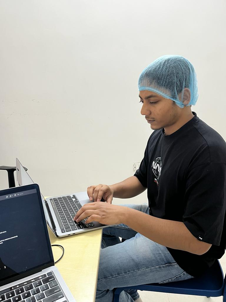
This photo is from one of those sessions. I brought a working prototype to the merchant's location and walked them through the new flows. Their reactions, confusion points, and "oh that's so much better" moments became the primary data that shaped every design decision that followed.
Research Synthesis
Strategic Approach
The product was too big to break all at once. With 32,000+ restaurants live, I proposed a phased approach. The key insight: not every improvement needs a flow change. Some of the highest-impact wins were purely visual.
I worked with product managers to define the scope of each phase, and with engineering managers to negotiate what could realistically ship inside sprint bandwidth. This was not a waterfall handoff. It was continuous negotiation and prioritization.
"If this sprint is busy, just ship colors and typography." That was the pitch I made to stakeholders. By breaking the redesign into layers of increasing complexity, I let engineering contribute even when their bandwidth was spent elsewhere. That pragmatism is what earned buy-in across every team.
Phased Rollout
I shipped the redesign in three deliberate phases. Each one delivered visible value while keeping disruption to merchants and engineering low.
Stakeholder Collaboration and Pushback
Not everyone agreed on day one. There was real pushback. Engineering worried about bandwidth. PMs had competing priorities. Some stakeholders doubted the ROI of a visual refresh. Building consensus was as much my job as pushing pixels.
Here is the loop that made it work. Test with merchants on-site. Bring the data back to internal stakeholders. Refine the designs from the combined merchant and stakeholder input. Then repeat. The cycle turned skeptics into advocates because the evidence was tangible, not theoretical.
Design Decisions and Tradeoffs
What I Chose, and Why
- Progressive enhancement over a big-bang redesign. A full redesign would have been cleaner, but the risk to 32,000+ merchants was too high. The phased approach reduced risk and built internal confidence step by step.
- Accessibility for low-literacy users. Larger touch targets, a high-contrast palette, icon-first navigation. Restaurant staff are not tech workers, so the interface had to be usable by someone who has never touched a SaaS product. I held the work to WCAG 2.1 AA.
- Hardware-aware design. The redesign was not just "desktop responsive." I tested it on the actual POS terminals and tablets merchants use: lower resolution, smaller screens, and sometimes spotty connectivity.
- Design system as infrastructure, not an afterthought. I built the system in parallel with the redesign, not after it. By the time other teams needed Phase 2 components, they were already documented and reusable in code.
What I Deliberately Left Out
- No gamification. The product needed to be faster, not more engaging. Operators do not want to be "delighted." They want to close orders and move to the next table.
- No dark mode, yet. Despite personal preference, the data did not support it. Merchants work in well-lit restaurants, so dark mode would have added complexity with no clear user benefit.
Before and After
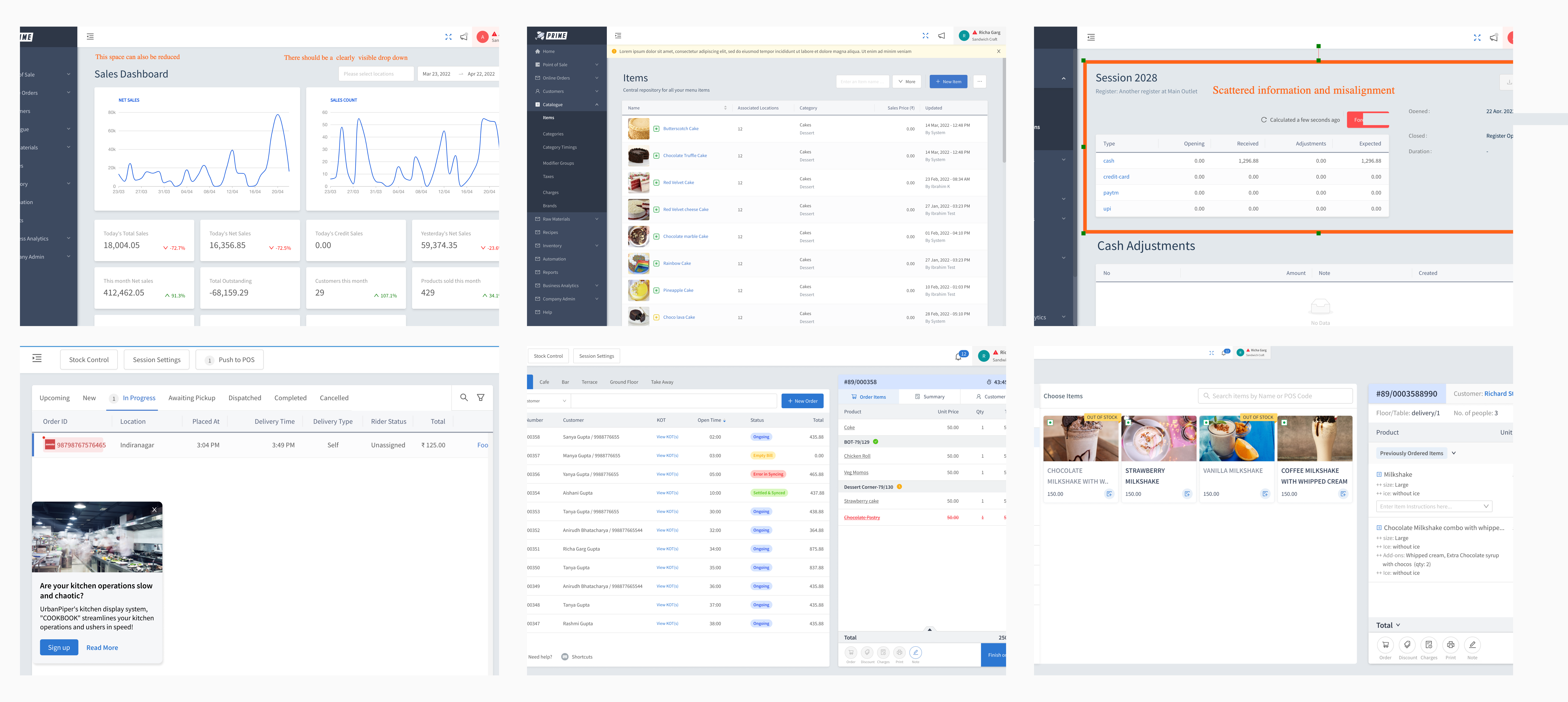
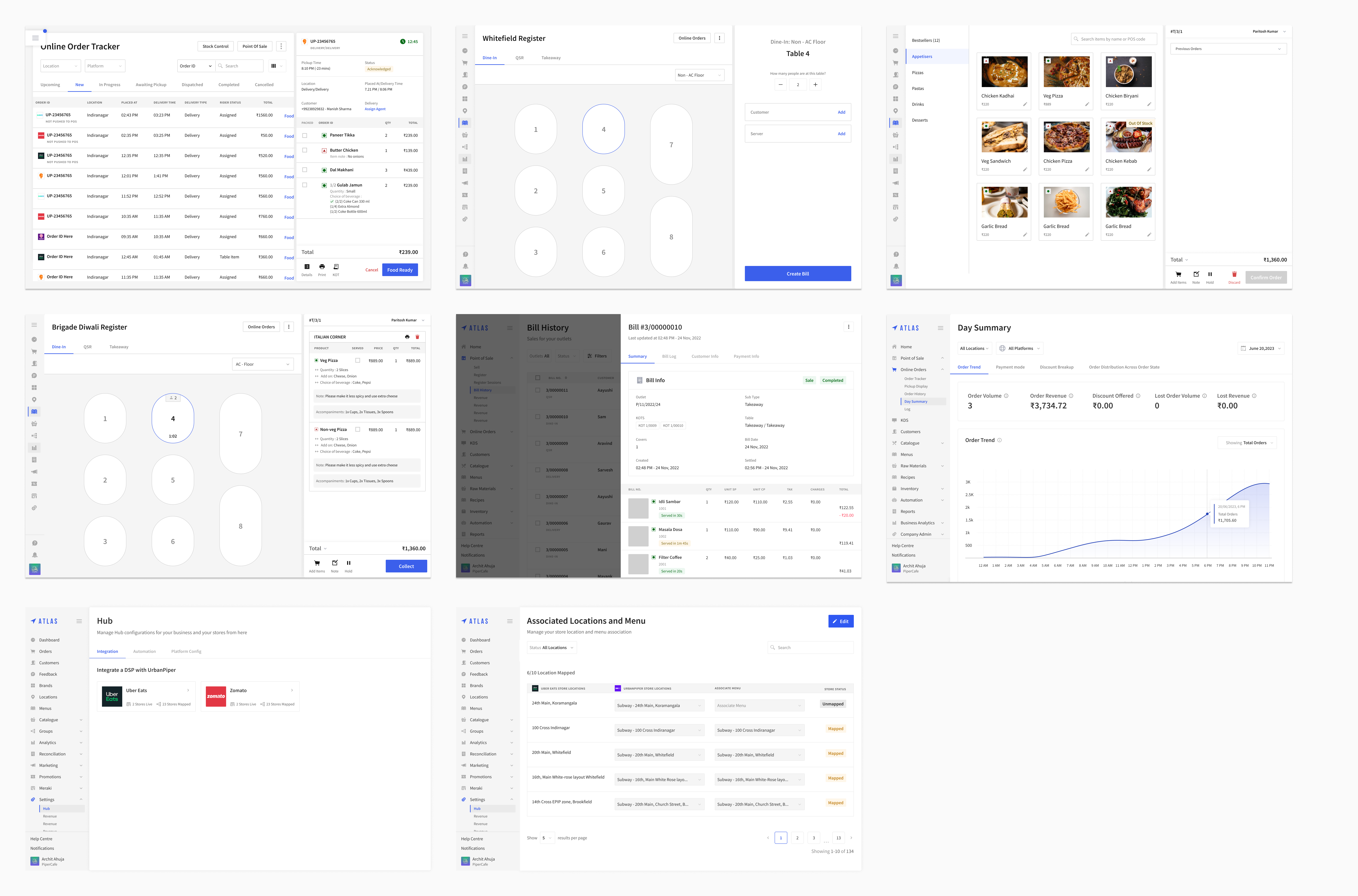
Scalable Design System
Before the redesign, there was no unified design system. Each team carried its own patterns, colors, and component styles, which fragmented the experience across the platform.
I built a complete design system from scratch: design tokens, atomic components (buttons, inputs, cards, modals), spacing scales, and an accessible, WCAG 2.1 AA color palette. The architecture followed a tokens, atoms, molecules, organisms model. I documented it thoroughly enough that engineers could self-serve routine UI work without pulling in design.
The real measure of a design system is not how it looks. It is adoption. 5 engineering teams across UrbanPiper adopted the system, bringing visual and interaction consistency to the entire platform for the first time.
Redesign Walkthrough
Results
Reflections and What I'd Do Next
This project taught me that the hardest part of a large-scale redesign is not the design. It is organizational alignment. Getting 5 engineering teams, multiple engineering managers, and a diverse merchant base to move in the same direction takes a different skill set than visual design. It takes negotiation, evidence-based persuasion, and the pragmatism to meet people where they are.
If I did it again, I would start the design system documentation earlier, before Phase 1. The system emerged organically from the redesign, which felt natural at the time but forced me to refactor some early decisions once the system took shape.
The phased approach was unconventional, and it earned its keep. It turned a potentially adversarial "you're changing everything" moment into a series of collaborative wins that built trust over time. Next, I would push the system toward live theming and a tighter Figma-to-code token pipeline so design and engineering stay in sync as the product keeps growing.